Did you know 38 percent of visitors will stop engaging with your blog if its layout is unattractive? Or that half of them would abandon your blog if it takes more than 3 seconds to load?
So while you’re spending hours in creating engaging content, your website design may have been playing a villain to you all this time.
Does it follow the latest website design trends?
How many website design tips and “tricks” have you read as of late?
Even if you believe everything is perfect, that might not necessarily be the case behind the scene.
Scoring decent on Google’s PageSpeed Insights is good but not sufficient.
The overall construction of your blog may have certain components that can totally put off the search engine spiders, as well as the visitors.

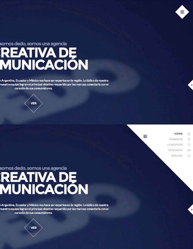
I complete adore hamburger menus.
If you’re reading this on your handheld device, you would find a header with hamburger sticking at the top of your screen.
However, there’s a problem.
The hamburger menu came into prominence because it offers simpler navigation and uncluttered interface.
It was also meant primarily for the mobile-users who usually dig clean UI.
Sadly, many people now are using this solution even in the desktop design of their blog for absolutely no reason at all.
Why do you need to hide your tabs on a desktop where there’s no shortage of space?
A research found that hiding the website’s main navigation can cut discoverability by almost half.
This comes in way of good user experience. And when that happens, it’s safe to assume that conversion rate remains low.
 |
- Many visitors still don’t actually know its function
- Content discoverability decreases, bounce rate increases
- It’s not required in the first place
Stick to good’ol tab navigation—be it in the header area or the sidebar. It’s ideal, simple and less confusing.
Recommended Read: 19 Steps to Reduce Bounce Rate
2. Multiple and Aggressive Pop-ups
Pop-ups are a necessary evil.
 |
You need subscribers? Make a pop-up subscription box. Want people to share the post? Get a pop-up with sharing buttons.
They are great to drive the desired action from the visitors.
When Entrepreneur(dot)com implemented opt-in pop-up, their subscription rate increased by 86 percent and sales by 162 percent.
On average, pop-up forms convert at around 3 percent, which isn’t bad.
Another research done by Sumo found that the top-performing 10 percent of pop-up forms convert at 9.3 percent. So yeah, they do work!
However, there are flaws that one simply cannot overlook.
Here’s a basic theory. People visiting your blog are going there to consume content. They are not looking to offer you their email. They don’t want to subscribe to you.
When you use an aggressive pop-up, it may scare away the visitors because that’s not what they want.
It also diverts users’ attention from the content, which is what they are looking for in the first place.
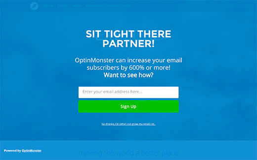
Once in a while, I always end up on websites that have multiple pop-ups trigger — form at the center of the page, slider at the bottom, a welcome mat.
Imagine, I have to click the cross mark three times to actually see the content clearly.
At times, the cancel option isn’t even visible. It’s like you either have to subscribe to them or get the hell out.
Naturally, I get the hell out of such websites, promising to never return.
 |
- Comes in way of user experience and usability.
- Increase bounce rate.
- Hurt SEO. Google announced over a year back that it will penalize pages where content is hard to consume.
- Hurts brand credibility (would you ever go back to a website that obsessively throws pop-ups?)
Now, in view of its effectiveness, you don’t have to get rid of pop-ups entirely. Just be more careful about how and why you use them.
Avoid aggressive, full-page pop-ups. Don’t have more than one on a single page.
And if you aren’t seeing any evident result, shake things up.
Change the format, trigger and CTA message. Don’t just stick to the same popup even when there’s poor or no conversion.
Recommended Read: How to Capture Email Address of (First-Time) Website Visitors
3. Homepage Carousel
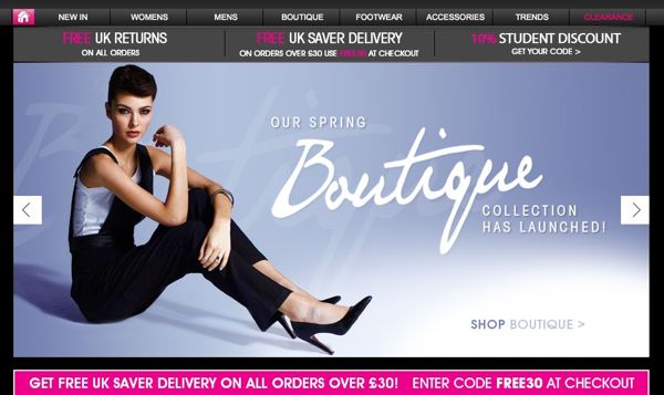 |
That thing was a complete rage a few years back. Some blogs, sadly, are still hung on it.
Admittedly, they look visually appealing. But that not before they totally mess up your SEO and UX, giving no evident benefits whatsoever.
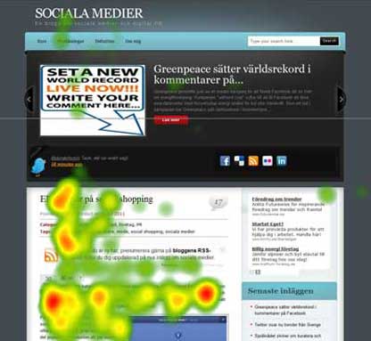
According to research, as mentioned on Yoast, only 1 percent of visitors actually click on a slide, which is often the first slide.
Several studies also confirmed that such image sliders are usually ignored by the visitors because they are confusing, trigger banner blindness, and come off as promotional.
 |
- Increase the loading time (thanks to large, HD images). This hurts SEO.
- Creates even more trouble in the mobile view.
- Take attention away from the content.
- Not much evidence available proving they convert well.
If you have one, please (please) take the carousel down! Today. Now.
Recommended Read: Website Speed and SEO: Does Your Site Loads in 2 Seconds?
4. Infinite Scrolling
Popularized by Pinterest and Facebook, a year back I was a fan of infinite scrolling myself.
Come on, it’s quite fancy and fitting to common sense. You keep on offering your visitors new and interesting content as they scroll down so that they never get the time to leave.
Reduces bounce rate, increases session duration — it looked like perfect for good users’ experience and SEO.
However, there was a flip side that stood hidden from me for quite some time.
First, infinite scrolling makes footer content irrelevant.
Second, the scrollbar becomes lagging, unreliable and difficult to use.
And most importantly, this feature comes in a way of how your website is crawled by the search engines.
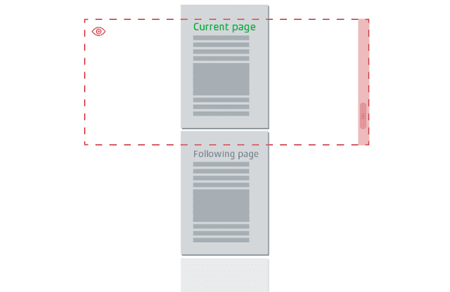
Infinite scrolling is one single page, even it is offering many posts. One page means one Meta description. This means search spiders fail to effectively crawl the rest of the pages and retract the right information for their use. In short, it hurts SEO.
 |
- Hurts SEO
- Affects the performance of the page
- Makes footer content unusable
Go for pagination over infinite scrolling. They are sweet, simple, fast and search engine friendly.
5. (Too Many) Floating Items
On many levels, I like floating elements. Like, a floating menu ensures the visitors that they have options to easily navigate to other pages.
Floating social share buttons tell them to share the content without being obnoxiously aggressive.
Sadly, like every good thing, this one, too, have few drawbacks that outweigh the benefits.
The floating action button is a bad UX move. Especially on the phone where the screen is small, visitors would hate it if a part of their screen is taken by a floating item.
Additionally, it also comes in way of usability and performance of the website, slowing down its smoothness.
 |
- Increase page loading time
- Degrade performance
- Obstructive on phone
Don’t get rid of them altogether. Limit their numbers.
Recommended Read: 16 Best Practices For Above The Fold Optimization
Conclusion
Blogging is all about connecting with your audience through your write-ups, and not through extravagant visuals and features.
I personally believe, the website design should be kept simple and light.
This is not to say though that you shouldn’t integrate to it any third-party plugins/widgets and follow the basic tips on website design.
- Of course, to hook your audience, you should get attractive fonts.
- To convert them into dedicated readers, you need a subscription form.
- To improve social share, you require a social share plugin.
Point is, adding functionality and usability to your website/blog isn’t bad.
However, the problem comes when people overdo it — when they do it unnecessarily and thoughtlessly without factoring different ends.
After all, your website design is a blend of an array of elements… What you want to offer, what your audience wants and what the search engine wants.
You want a subscription form so you used JavaScript, but that’s not what Google wants.
Your audience wants to read your post and leave, but that’s not what you want (you want them to share the post, subscribe for newsletters).
So you must strike a perfect balance between these elements to keep everyone happy. Yourself, included.
Call To Action
Now…
If your website design falls short in any department, make needed changes immediately.
Highlight a clear distinction between what is essential and what is unnecessary—and then get rid of the latter ones.
Start by doing away with the above-mentioned points/features.
Make the website/blog lightweight and SEO-friendly that offers good User Experience (UX).
Remember, as clichéd as it may sound…
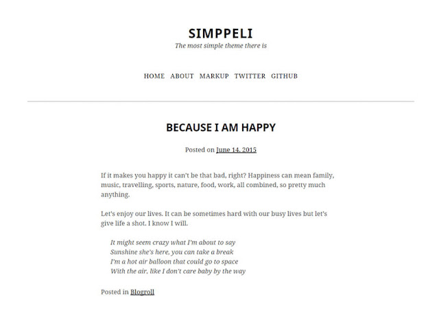
There’s beauty even in simplicity! 😉
 |
